Sunday 28 March 2010
I’m sure you’ve noticed that I’ve been upgrading the design of some parts of the site. The front page was first, and I just updated the chapter pages.
I’ll try to remember the changes to content and functionality:
- In the right sidebar, the recent comments, blog posts, etc., are removed since these are now visible on the front page. I wanted the chapter-reading page to be more focused on the chapter, but if this change freaks you out, let me know.
- Publish date and last update date are displayed in the sidebar.
- There are links to jump directly to the comments and directly to the add-comment form.
- I moved the chapter character list and storyline list to the right sidebar.
- The storyline display in the right sidebar now features the storyline picture.
- The next-previous navigation at the end of the chapter now features pictures. The pictures are automatically generated but they are broken for the first few chapters. I will have to fix that.

- The next-previous navigation with pictures is also repeated at the bottom of the page, beneath the comment form. (Unless you have comments turned off.)
- On the edit comment page, there is now a working “Preview comment” button.
- The full footer, like the one on the front page, is now applied.
- I just noticed I forgot to add the “Preview Banner” link back in so you can see the chapter’s original preview banner.
 I will do that later.
 - The “Edit” and “Delete” links on comments are now added on the client-side by JavaScript, which should hopefully make pages load a little faster. If all goes well you should not see any change in the functionality of those links, other than the fact that you won’t see them at all if you disable javascript in your browser.
That’s all I can think of for the moment. Please post here or in the forum if you notice any bugs.
Please also tell me if there is something you don’t like about the new layout and design. It’s a work in progress, but I wanted to get it out there so I (and you) can start using it and get a feel for where it needs fixing. If there’s anything you liked better in the old version, or found easier to read or whatever, feel free to tell me. I’m a professional – I hear complaints about my Web sites all the time, so I won’t take it personally. ![]()
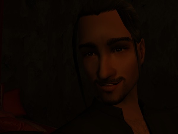
Now I have to run and make dinner, but I have just enough time to add some eye candy. So here’s a preview of a future chapter involving Mr. Caterpillars. Magog may make an ugly woman, but he’s a fine-looking man.


 I will look into that too. *makes note* It's not deleted (yet), it's just marked as spam -- that's why it's gray.


I LIKE it! It seems the colours are more vibrant as well, making the pictures stand out even more! And moving all the other sections to the bottom is brilliant, I think. Makes you read the chapter before getting to the "extra" stuff available to read/see. Can't wait to see the rest of the changes coming. Having each person's avatar outside their comment post looks great too. Plus the colour distinction between yours and ours. Is that what's intended? Or can everyone choose a colour for their comments? All in all .... F-A-B-U-L-O-U-S!