Friday 2 April 2010

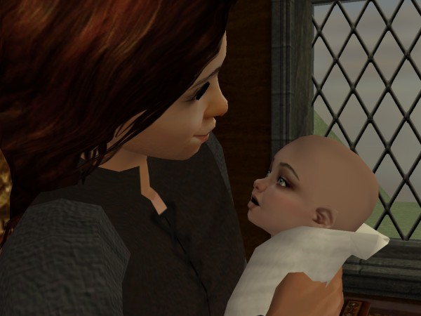
Sir Selwyn and Lady Edeltrude are proud to announce the birth of their son
February 3rd, 1086
Mother and baby are doing fine. ![]() I don’t think it has quite hit Selwyn yet.
I don’t think it has quite hit Selwyn yet.
Site Updates
Verso Menus
I fixed the menus on the bio, Verso, demographics, etc. pages. As François pointed out (and I think wawa was getting at it too) the top menus below the pictures had disappeared. The only thing left was the “Story”, “Verso”, etc. links across the top. That’s fixed now.
Chapter Pages
I rejigged the header on chapter-reading pages. I originally had a smaller version of the preview banner, and the black left sidebar went all the way up to the top. I felt like I was wasting a lot of space that way.
So now the preview image is shown at full size, the left sidebar starts below it, and I moved the calendar up into the place that is occupied by the “story-worthy life” quote on the front page. Now instead of too empty, I feel like it’s too busy. ![]() I’ll keep trying.
I’ll keep trying.
User Preferences
You can now set preferences even if you are not logged in. Scroll down to the bottom of any of the new-style pages and click on “My Preferences” in the footer.
If you are logged in, your preferences will be saved on the server, which means they will be the same on any computer you log in from.
If you are not logged in, your preferences will be saved as cookies in your browser, so if you clear cookies or switch to a different computer you will have to set them again.
I also added some new preferences.
Theme: I have a half-finished port of the old colors to the new layout. If you really can’t stand the new colors, you can switch to “Gilded”. I still have to resize some images for the Gilded theme, plus have a look at some things that are too bright or too blue now in the new layout.
Text size: Those of you who found the new text size too large, you can now set it to something smaller. I also decreased the spacing between paragraphs in the chapters, so you should be able to fit slightly more on your screen. (This is true for all of the text sizes.)
Show Recent Stuff in Sidebar: If you missed the “Recent Comments”, “New on Verso”, and “Latest in the Forum” section in the right sidebar, you can now add those back in. Only 4 recent comments will be shown instead of 10. And instead of “New on Verso” I now have it showing the latest quote or Verso post, depending on which has been created most recently. Sometimes I went weeks without making a blog post, so this way it won’t be quite such “old news” in the sidebar all the time.
Trigger Warnings: This isn’t brand-new, but I thought I should mention it to explain it. Later on I will be adding some kind of slightly-more specific warning icons for subject matter, but right now there is either a simple yellow warning icon, or nothing. So this is a “future” preference that I still have to implement. (Also, I have not yet assigned warnings to chapters, except for “Twilight’s End,” since I needed a test case.)
Teen Female Renaissance Dress
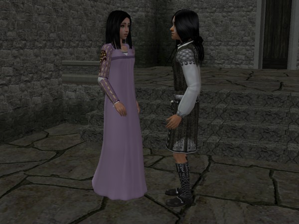
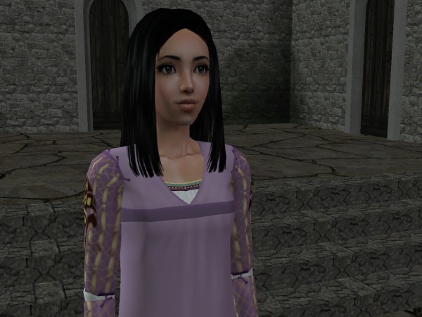
I love this mesh so much I thought it warranted a special mention in a blog post. If you’ve been reading comments lately you’ll know I have been raving about the idea of having a non-skin-tight dress for my teen girls. I finally looked at it in-game and I absolutely adore it. The mesh even has tiny bows on the sleeves!
I also think that hair will be adorable on Gwynn’s little heart-shaped face, but I forgot to try it out. ![]()
So here she is. Doesn’t the dress makes her look so grown-up? *sniffle*


It's cute, but the band across the bosom annoys the crap outta me. I feel like it would be under them, not over.I do think it suits Miss Gwynn.